


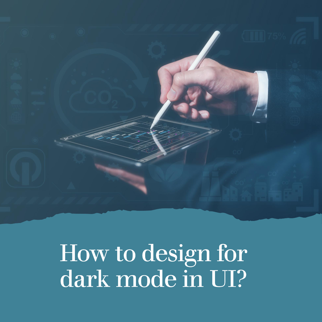
How to design for dark mode in UI?
Dark mode is a UI mode that uses dark colors and backgrounds. It is available on many devices and apps, and it is becoming increasingly popular.
There are a number of benefits to using dark mode, including:
- It can reduce eye strain. Dark mode can be easier on the eyes in low-light environments.
- It can improve battery life. Dark mode can help to improve battery life on devices with OLED displays.
- It can create a more immersive experience. Dark mode can create a more immersive experience for users, especially when watching videos or playing games.
If you are designing a UI, it is important to consider dark mode. By designing your UI for dark mode, you can make it more accessible and user-friendly for a wider range of users.
Here are some tips for designing for dark mode in UI:
- Use high-contrast colors. When designing for dark mode, it is important to use high-contrast colors. This will help to ensure that your UI is still readable and easy to use in dark environments.
- Avoid pure white text. Pure white text can be difficult to read on dark backgrounds. Instead, use a lighter shade of gray or another color that will provide good contrast with the background.
- Use shadows and highlights to create depth. Shadows and highlights can be used to create depth in your UI, even in dark mode. This can help to make your UI more visually appealing and easier to use.
- Test your UI in dark mode. Once you have designed your UI for dark mode, be sure to test it out in dark mode to make sure that it is still readable and easy to use.
Here are some additional tips for designing for dark mode in UI:
- Use a consistent color palette. When designing for dark mode, it is important to use a consistent color palette. This will help to create a unified look and feel for your UI.
- Use a limited number of colors. It is generally best to use a limited number of colors in your UI, especially in dark mode. This will help to prevent your UI from becoming too cluttered or overwhelming.
- Use typography to your advantage. Typography can be used to create a hierarchy in your UI and to make important information stand out. When designing for dark mode, use typography to help users to scan your UI and quickly identify the most important information.
- Use animations and transitions. Animations and transitions can be used to make your UI more engaging and visually appealing. When designing for dark mode, use animations and transitions to help users to understand how your UI works.
Examples of effective dark mode design in UI
Here are some examples of effective dark mode design in UI:
- Google: Google uses a dark mode that uses dark colors and backgrounds with high-contrast text. This makes their UI easy to read and use in dark environments.
- Apple: Apple uses a dark mode that uses dark colors and backgrounds with white text. However, the white text is not pure white, but rather a lighter shade of gray. This makes the text easy to read without being too bright in dark environments.
- Twitter: Twitter uses a dark mode that uses dark colors and backgrounds with white text. However, the white text is not pure white, but rather a lighter shade of gray. This makes the text easy to read without being too bright in dark environments. Twitter also uses animations and transitions to make their UI more engaging and visually appealing in dark mode.
Conclusion
Designing for dark mode is an important part of creating a user-friendly and accessible UI. By following the tips in this blog post, you can design a UI that looks great and functions well in both light and dark mode.


Related Articles
10 Best Gaming Laptops for 2026
The gaming laptop market in 2026 has reached an exciting new milestone....
Studio555’s Playable App for Interior Design
Okay, picture this: You’re scrolling through interior design inspo online (we’ve all...
Aspora’s $50M Boost: Simplifying Money Transfers for Indians Abroad
Ever wondered why sending money back home can still feel like navigating...
Navy’s New Startup Crush: Is This the Future of Defense Tech?
Forget the image of stuffy boardrooms and endless red tape. The U.S....
Leave a comment