


How to design for mobile responsiveness in graphic design?
 Eldad Gaih20 November 20232 Mins read
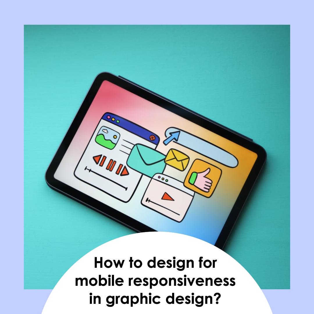
How to design for mobile responsiveness in graphic design?
Designing for Mobile Responsiveness: Adapting Graphic Design for the Digital Age
In today’s digital landscape, where mobile devices have become the primary means of accessing the internet, mobile responsiveness has emerged as a critical aspect of graphic design. Mobile responsiveness ensures that websites, applications, and other visual content adapt seamlessly to different screen sizes and display resolutions, providing a consistent and user-friendly experience across various devices.
The Importance of Mobile Responsiveness in Graphic Design
Mobile responsiveness is not merely a technical consideration; it has a profound impact on the effectiveness of graphic design:
- Enhanced User Experience: A responsive design ensures that users can interact with a website or application seamlessly, regardless of their device, leading to a more positive and engaging experience.
- Improved Search Engine Optimization (SEO): Search engines prioritize websites that are optimized for mobile devices, boosting their visibility and ranking in search results.
- Increased Accessibility: Responsive design promotes accessibility by ensuring that content is accessible to users with varying visual impairments or device capabilities.
- Brand Consistency: A consistent visual identity across all devices strengthens brand recognition and reinforces the brand’s message.
- Cost-Effectiveness: Responsive design eliminates the need to create separate versions for different devices, reducing development and maintenance costs.
Principles of Mobile Responsive Web Design
Several principles underpin mobile responsive web design:
- Fluid Grids: Fluid grids allow elements to scale and adjust proportionally to the screen size, ensuring a harmonious layout across different devices.
- Media Queries: Media queries enable designers to specify different styles for different screen sizes, ensuring that the design adapts to the specific dimensions of each device.
- Progressive Enhancement: Progressive enhancement prioritizes core functionality for all devices, while providing additional enhancements for devices that support them.
- Minimalism: A minimalist approach reduces clutter and simplifies the design, making it easier to navigate and interact with on smaller screens.
- Touch-Friendly Elements: Design elements should be large enough and spaced appropriately for easy tapping and scrolling on touchscreens.
Tools and Techniques for Mobile Responsive Design
Several tools and techniques can aid in creating mobile responsive designs:
- Responsive Frameworks: Frameworks like Bootstrap and Foundation provide pre-built CSS grids and components, streamlining the responsive design process.
- Emulators and Simulators: Emulators and simulators allow designers to preview their designs on various devices, testing their responsiveness in different environments.
- Responsive Testing Tools: Specialized testing tools can identify and address responsiveness issues, ensuring a consistent experience across devices.
Best Practices for Mobile Responsive Graphic Design
In addition to adhering to the principles of mobile responsive web design, graphic designers should follow these best practices:
- Start with Mobile-First Design: Begin the design process by considering the mobile experience first, ensuring that the design is optimized for smaller screens.
- Focus on Content Hierarchy: Prioritize the most important content and ensure that it is easily accessible and visually prominent on mobile devices.
- Utilize High-Quality Images: Use high-resolution images that are optimized for different screen sizes, maintaining visual quality across devices.
- Test and Iterate: Continuously test the design on various devices and gather feedback from users to refine the responsiveness and user experience.
- Stay Updated with Mobile Trends: Keep abreast of the latest trends and advancements in mobile technology to ensure that designs remain relevant and effective.
Conclusion: Embracing Mobile Responsiveness for a Seamless Digital Experience
Mobile responsiveness has become an essential consideration for graphic designers, as mobile devices continue to dominate the digital landscape. By embracing the principles of mobile responsive design, utilizing appropriate tools and techniques, and following best practices, graphic designers can create visually appealing, user-friendly, and effective designs that seamlessly adapt to the ever-evolving world of mobile technology.


Related Articles

10 Best Gaming Laptops for 2026
The gaming laptop market in 2026 has reached an exciting new milestone....

Liquid Glass & Augmented Dreams: Is Apple Teasing its AR Glasses?
Ever get that feeling when a company does something new, and you...

Ear to the Ground: Google Might Soon *Speak* Your Search Results!
Ever felt like you just don’t have time to read through all...

Waymo’s Price Tag: Is Self-Driving Worth the Cost?
Waymo’s Price Tag: Is Self-Driving Worth the Cost? Ever wondered what it...
Leave a comment