- Home
- AI Solution Kits
- AI Analytics and Business Intelligence
- AI Coding and Development Tools
- AI Content Creation and Video Tools
- AI Customer Support Solutions
- AI Email and Communication Tools
- AI for E-Commerce
- AI Image and Creative Tools
- AI Marketing Automation
- AI Recruitment and HR Solutions
- AI Sales and Outreach Automation
- AI Workflow and Process Automation
- AI-Powered Communication and Phone Systems
- Solutions
- No-Code and App Building Solutions
- Recruitment and Talent Acquisition Solutions
- Scheduling and Calendar Management Solutions
- Sales and Outreach Solutions
- Security Solutions
- Social Media and Influencer Marketing Solutions
- Team Communication Solutions
- Training and Development Solutions
- Webinar and Video Marketing Solutions
- Website and E-commerce Solutions
- Workflow and Process Automation Solutions
- Productivity and Project Management
- Website and Customer Experience Optimization
- Tools
- Contact US
Recent Posts
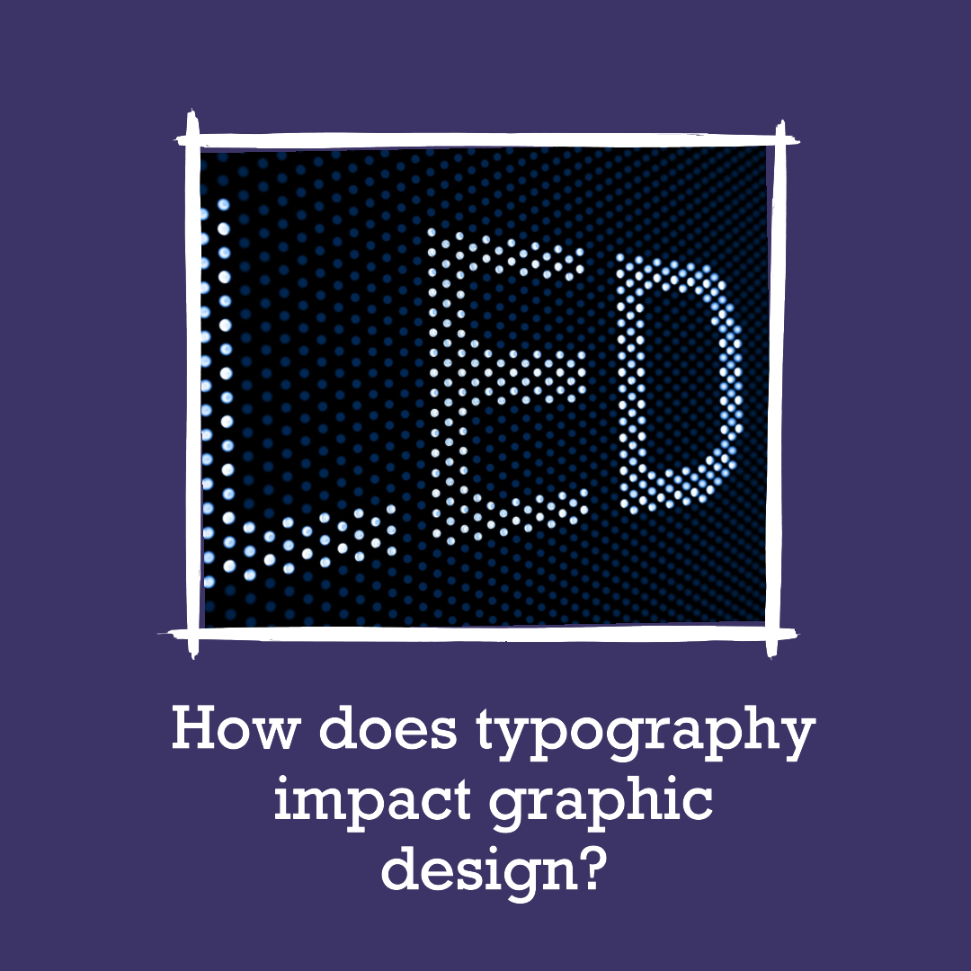
How does typography impact graphic design?


How does typography impact graphic design?
Typography, the art of arranging and selecting typefaces, plays a crucial role in graphic design. It has the power to enhance the visual appeal of designs, convey emotions, and establish a brand’s identity. Understanding the impact of typography on graphic design is essential for creating effective and impactful visual communication.
The Significance of Typography in Graphic Design
Typography holds immense significance in graphic design for several reasons:
- Readability: Typography ensures that text is easily readable and visually appealing, making it accessible to a wider audience.
- Hierarchy: Typography establishes a hierarchy of information, guiding the viewer’s eye through the design and highlighting important elements.
- Emotion and Tone: Typography can convey emotions and tone, setting the mood of the design and influencing the viewer’s perception.
- Brand Identity: Typography plays a pivotal role in establishing and reinforcing a brand’s identity, making it recognizable and memorable.
- Visual Harmony: Typography contributes to the overall visual harmony of a design, balancing different elements and creating a cohesive aesthetic.
Elements of Typography: The Building Blocks of Effective Design
Typography comprises several essential elements that influence its impact on graphic design:
- Typefaces: The choice of typeface, such as serif, sans-serif, or script, significantly impacts the overall look and feel of a design.
- Font Size: The size of the font determines the prominence of text and guides the viewer’s attention.
- Leading: The spacing between lines of text, known as leading, affects readability and visual balance.
- Kerning: The adjustment of spacing between individual letters ensures evenness and visual harmony.
- Alignment: The alignment of text, such as left-aligned, centered, or justified, influences the visual structure and readability.
Typography and Emotional Communication: Evoking Feelings through Design
Typography has the power to evoke emotions and set the tone of a design, influencing the viewer’s perception. For instance, serif fonts often convey a sense of tradition and elegance, while sans-serif fonts project a modern and minimalist aesthetic. Script fonts can evoke a sense of femininity or formality, while bold, heavy fonts can exude energy and power.
Typography and Brand Identity: Establishing Recognition and Recall
Typography plays a crucial role in establishing and reinforcing a brand’s identity. By consistently using specific typefaces, colors, and styles, brands can create a recognizable visual language that sets them apart from competitors and becomes associated with their values and personality.
Typography and Visual Harmony: Achieving Balance and Cohesion
Typography contributes to the overall visual harmony of a design by balancing different elements and creating a cohesive aesthetic. The selection of typefaces, font sizes, and spacing should complement the overall design style and ensure that the text blends seamlessly with the other visual components.
Effective Typography in Action: Examples of Notable Designs
Several notable graphic design examples showcase the power of typography in creating memorable and impactful visuals:
- The Apple logo: The simplicity and elegance of the Apple logo, with its stylized sans-serif typeface, has become synonymous with the brand’s innovative spirit and minimalist aesthetic.
- The Coca-Cola logo: The distinctive script typeface of the Coca-Cola logo, with its flowing curves and familiar red color, has become an iconic symbol of refreshment and happiness.
- The FedEx logo: The contrast between the bold, geometric typeface for “FedEx” and the sleek, italicized “Express” in the FedEx logo creates a sense of movement and dynamism, reflecting the brand’s commitment to efficiency and speed.
- The Volkswagen logo: The rounded and friendly appearance of the Volkswagen logo, with its circular shape and bold, sans-serif typeface, conveys a sense of approachability and reliability, aligning with the brand’s reputation for producing family-friendly cars.
- The Nike logo: The swoosh symbol and the condensed, sans-serif typeface of the Nike logo exude energy, movement, and athleticism, perfectly capturing the brand’s association with sports and performance.
Conclusion: Typography as a Cornerstone of Graphic Design
Typography stands as a cornerstone of graphic design, shaping the visual appeal, emotional impact, and brand identity of designs. By understanding the principles of typography and its influence on perception, graphic designers can create effective and impactful visual communication that resonates with their audience and achieves their desired outcomes.
techwitheldad.com
Eldad is a graphic designer and web developer with over 7 years of experience. He is also the founder and director of Vitna Media, a full-service digital marketing agency. Eldad has a passion for helping people learn and grow. He is also a strong believer in the power of technology to make the world a better place. In his spare time, Eldad enjoys spending time with his family and friends, playing music instruments and traveling.
Recent Posts
10 Best Gaming Laptops for 2026
16 January 2026Studio555’s Playable App for Interior Design
16 June 2025Categories
Related Articles
10 Best Gaming Laptops for 2026
The gaming laptop market in 2026 has reached an exciting new milestone....
ByGlen16 January 2026Studio555’s Playable App for Interior Design
Okay, picture this: You’re scrolling through interior design inspo online (we’ve all...
Bytechwitheldad.com16 June 2025Aspora’s $50M Boost: Simplifying Money Transfers for Indians Abroad
Ever wondered why sending money back home can still feel like navigating...
Bytechwitheldad.com16 June 2025Navy’s New Startup Crush: Is This the Future of Defense Tech?
Forget the image of stuffy boardrooms and endless red tape. The U.S....
Bytechwitheldad.com16 June 2025


Leave a comment