


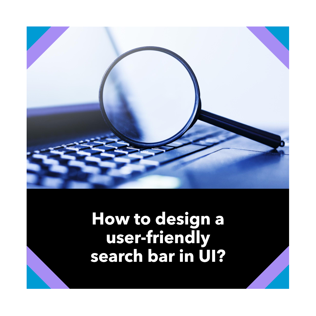
How to design a user-friendly search bar in UI?
Search is one of the most essential features of any user interface (UI). It allows users to quickly and easily find the information they need, whether they’re browsing a website, using an app, or working on a document.
A well-designed search bar is both easy to use and effective at returning relevant results. It should be prominently visible, easy to understand, and provide users with the feedback they need to refine their searches as needed.
In this article, we’ll discuss the key principles of designing a user-friendly search bar in UI. We’ll cover topics such as:
- Placement and visibility
- Size and shape
- Iconography
- Placeholder text
- Autocomplete
- Search results
Placement and visibility
The search bar should be prominently visible on the page, typically in the header or navigation area. This allows users to easily find it whenever they need to search for something.
If you have a lot of content on your page, you may also want to consider adding a second search bar at the bottom of the page. This can be helpful for users who are scrolling through a long page and need to quickly find something without having to scroll back to the top.
Size and shape
The search bar should be large enough to be easily visible and accessible, but not so large that it dominates the page. A good rule of thumb is to make the search bar the same width as the navigation bar.
The shape of the search bar should also be consistent with the overall design of your UI. For example, if your UI has rounded corners, you should use a rounded search bar.
Iconography
Most users expect to see a magnifying glass icon next to the search bar. This is a universally recognized symbol for search, so it’s a good idea to include it in your search bar design.
You can also use other icons to indicate the type of content that can be searched. For example, if your website sells books, you could use a book icon next to the search bar to indicate that users can search for books by title, author, or genre.
Placeholder text
Placeholder text is a helpful way to guide users on what they can search for. It should be brief and to the point, and it should be relevant to the type of content that can be searched.
For example, if your website sells clothes, you could use the placeholder text “Search for clothes by style, color, or brand.”
Autocomplete
Autocomplete is a feature that suggests search results as the user is typing. This can be a helpful way to save users time and help them find the information they’re looking for more quickly.
When designing an autocomplete feature, it’s important to make sure that the suggestions are relevant and helpful. You should also allow users to easily disable the autocomplete feature if they prefer.
Search results
The search results page should be designed to be easy to scan and navigate. The results should be displayed in a clear and concise format, and they should be ranked based on their relevance to the user’s search query.
You should also provide users with the ability to filter and sort the search results. This can help them to narrow down the results and find the information they’re looking for more quickly. More on user-friendly search bar
4 key tips for designing a user-friendly search bar in UI
- Make sure the search bar is responsive and works well on all devices, including smartphones and tablets.
- Use clear and concise error messaging if the user enters a search query that doesn’t match any results.
- Provide users with the ability to save their search history. This can be helpful for users who frequently search for the same things.
- Conduct user testing to get feedback on your search bar design and identify any areas for improvement.
Conclusion
By following these tips, you can design a search bar that is both user-friendly and effective. A well-designed search bar will help users to find the information they need quickly and easily, and it will ultimately improve the overall user experience of your website or app.


Related Articles

10 Best Gaming Laptops for 2026
The gaming laptop market in 2026 has reached an exciting new milestone....

Liquid Glass & Augmented Dreams: Is Apple Teasing its AR Glasses?
Ever get that feeling when a company does something new, and you...

Ear to the Ground: Google Might Soon *Speak* Your Search Results!
Ever felt like you just don’t have time to read through all...

Waymo’s Price Tag: Is Self-Driving Worth the Cost?
Waymo’s Price Tag: Is Self-Driving Worth the Cost? Ever wondered what it...
Leave a comment