


How to design a dashboard with data visualization in UI?
How to design a dashboard with data visualization in UI?
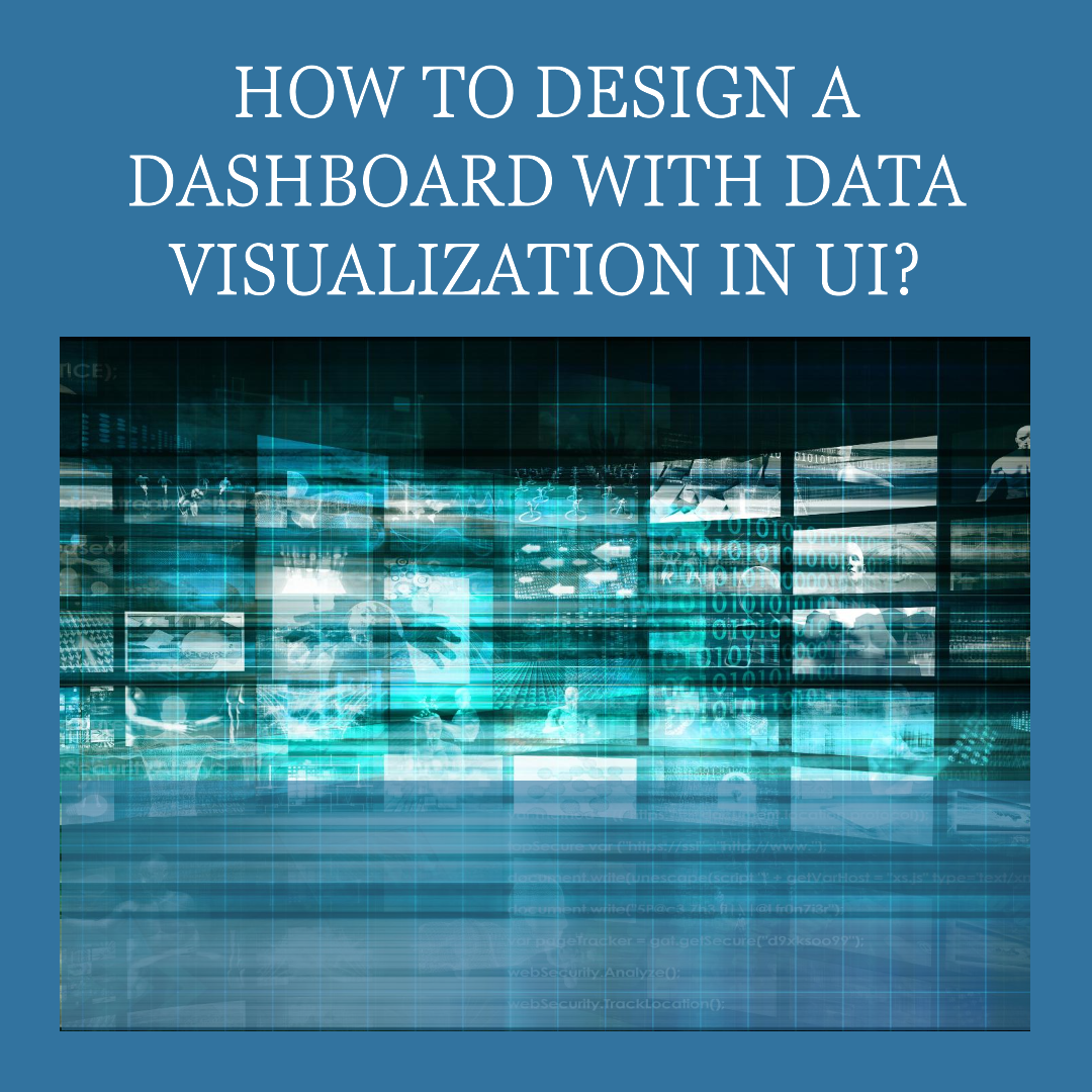
Dashboards are visual representations of data that provide users with a quick and easy way to understand and monitor important metrics. They are often used in business intelligence (BI) and analytics applications to help users track key performance indicators (KPIs), identify trends, and make informed decisions.
Data visualization is the process of representing data in a visual format, such as charts, graphs, and maps. It is an important part of dashboard design, as it allows users to quickly and easily understand complex data sets.
How to design a dashboard with data visualization in UI
Here are some tips for designing a dashboard with data visualization in UI:
- Define the purpose of your dashboard. What do you want users to be able to do with your dashboard? What information do you want them to be able to see? Once you have a clear understanding of the purpose of your dashboard, you can start to think about the type of data you need to visualize and how you want to present it.
- Choose the right data visualization techniques. There are many different data visualization techniques available, such as charts, graphs, and maps. Choose the techniques that are best suited for the type of data you are visualizing and the purpose of your dashboard.
- Use a consistent design. Your dashboard should have a consistent design throughout. This means using the same colors, fonts, and layout elements throughout. This will help to make your dashboard look more polished and professional.
- Make your dashboard interactive. Interactive dashboards allow users to explore the data and get more insights. Consider adding features such as filtering, sorting, and drilling down to allow users to interact with the data in a meaningful way.
- Test your dashboard with users. Once you have designed your dashboard, test it with users to get feedback. This will help you to identify any usability issues and make necessary refinements.
Here are some additional tips for designing a dashboard with data visualization in UI:
- Use clear and concise labels. Users should be able to quickly understand what each element of the dashboard is visualizing. Use clear and concise labels to identify the data being visualized and the units of measurement.
- Use white space. White space can help to make your dashboard look less cluttered and easier to scan. Use white space to separate different elements of the dashboard and to highlight important information.
- Use color effectively. Color can be used to highlight important information and to make your dashboard more visually appealing. However, avoid using too many colors, as this can make your dashboard look cluttered and difficult to read.
- Use typography effectively. Typography can be used to make your dashboard more readable and visually appealing. Choose fonts that are easy to read and that complement the overall design of your dashboard.
Examples of well-designed dashboards with data visualization in UI
Here are some examples of well-designed dashboards with data visualization in UI:
- Google Analytics: Google Analytics provides a variety of dashboards that allow users to track their website traffic and performance. The dashboards are well-designed and use a variety of data visualization techniques to present information in a clear and concise way.
- Tableau: Tableau is a data visualization software platform that allows users to create custom dashboards. Tableau provides a variety of pre-built dashboards and templates, as well as the ability to create custom dashboards from scratch.
- Power BI: Power BI is another data visualization software platform that allows users to create custom dashboards. Power BI provides a variety of pre-built dashboards and templates, as well as the ability to create custom dashboards from scratch.
Conclusion
By following the tips in this blog post, you can design effective dashboards with data visualization in UI. Well-designed dashboards can help users to quickly and easily understand complex data sets, identify trends, and make informed decisions.tunesharemore_vert


Related Articles

10 Best Gaming Laptops for 2026
The gaming laptop market in 2026 has reached an exciting new milestone....

Liquid Glass & Augmented Dreams: Is Apple Teasing its AR Glasses?
Ever get that feeling when a company does something new, and you...

Ear to the Ground: Google Might Soon *Speak* Your Search Results!
Ever felt like you just don’t have time to read through all...

Waymo’s Price Tag: Is Self-Driving Worth the Cost?
Waymo’s Price Tag: Is Self-Driving Worth the Cost? Ever wondered what it...
Leave a comment