- Home
- AI Solution Kits
- AI Analytics and Business Intelligence
- AI Coding and Development Tools
- AI Content Creation and Video Tools
- AI Customer Support Solutions
- AI Email and Communication Tools
- AI for E-Commerce
- AI Image and Creative Tools
- AI Marketing Automation
- AI Recruitment and HR Solutions
- AI Sales and Outreach Automation
- AI Workflow and Process Automation
- AI-Powered Communication and Phone Systems
- Solutions
- No-Code and App Building Solutions
- Recruitment and Talent Acquisition Solutions
- Scheduling and Calendar Management Solutions
- Sales and Outreach Solutions
- Security Solutions
- Social Media and Influencer Marketing Solutions
- Team Communication Solutions
- Training and Development Solutions
- Webinar and Video Marketing Solutions
- Website and E-commerce Solutions
- Workflow and Process Automation Solutions
- Productivity and Project Management
- Website and Customer Experience Optimization
- Tools
- Contact US
Recent Posts
What are the best color combinations for graphic design?
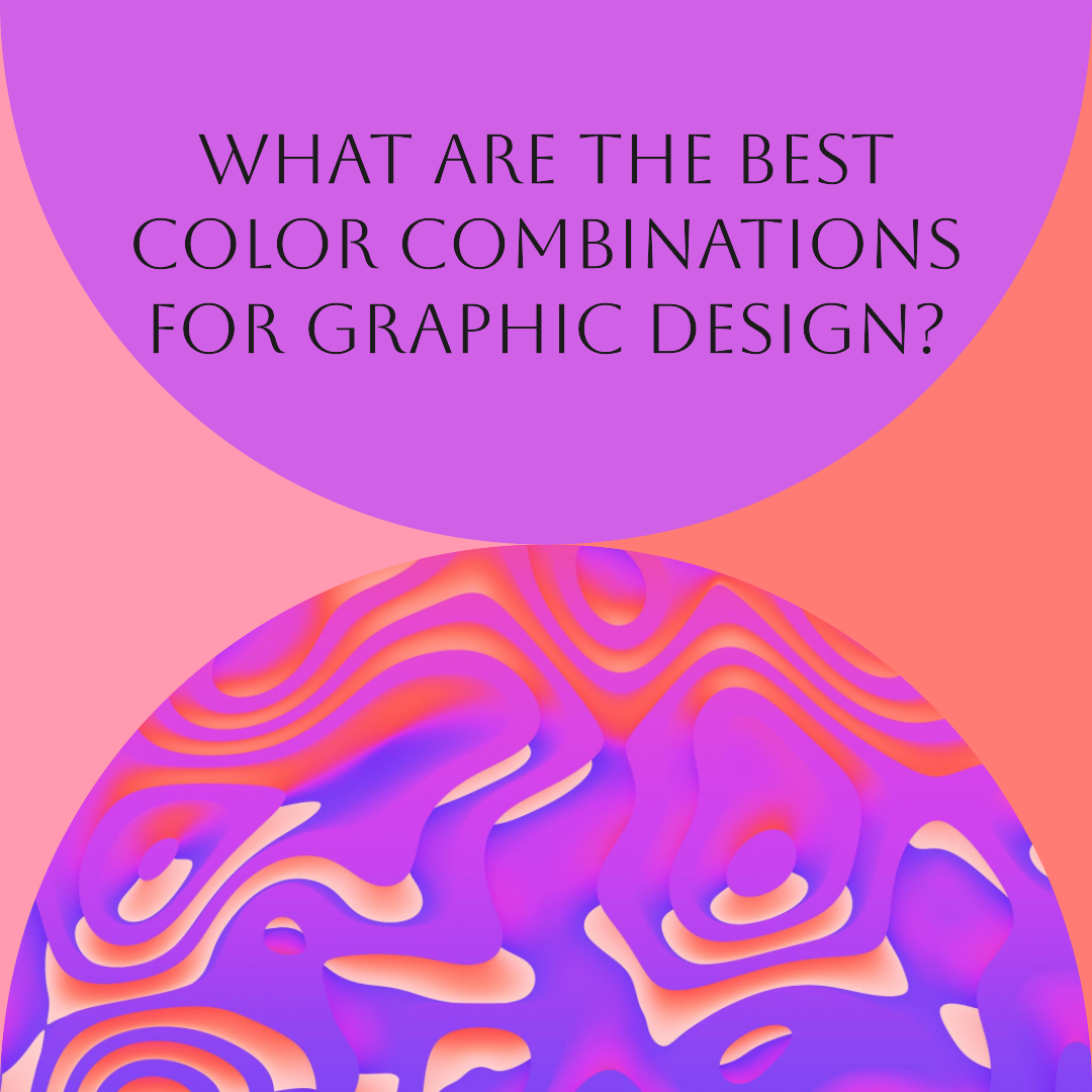

What are the best color combinations for graphic design?
The Art of Color Harmony: Unraveling the Best Color Combinations for Graphic Design
In the realm of graphic design, color reigns supreme as a powerful tool that evokes emotions, conveys messages, and shapes visual perceptions. The right color combination can elevate a design from ordinary to extraordinary, transforming a blank canvas into a masterpiece that resonates with its audience.
While the world of colors is vast and seemingly endless, certain color combinations stand out as timeless and aesthetically pleasing. These pairings exude harmony, balance, and visual appeal, making them ideal for creating impactful graphic designs.
Understanding Color Theory: The Foundation for Effective Color Combinations
Before delving into the best color combinations, it’s essential to grasp the fundamentals of color theory. This foundational knowledge provides a framework for understanding how colors interact and create visual harmony.
The color wheel serves as a roadmap for understanding color relationships. It presents the three primary colors (red, yellow, and blue) from which all other colors are derived. These primary colors, when mixed in varying proportions, give rise to secondary colors (orange, green, and purple) and tertiary colors (red-orange, yellow-green, blue-green, blue-violet, red-violet, and yellow-orange).
Color theory also explores color relationships, such as complementary colors, analogous colors, and triadic colors. Complementary colors are opposite each other on the color wheel, creating a striking contrast that can be both energizing and visually stimulating. Analogous colors, on the other hand, sit next to each other on the color wheel, producing a harmonious and pleasing effect. Triadic colors form an equilateral triangle on the color wheel, creating a vibrant and lively color palette.
Harnessing the Power of Color Psychology: Evoking Emotions and Associations
Colors are not merely visual elements; they possess the power to evoke emotions and associations that can influence user perception and behavior. Understanding color psychology is crucial for graphic designers, as it allows them to select colors strategically to achieve specific design goals.
For instance, the color red is often associated with passion, energy, and excitement. It can be used to capture attention, convey urgency, or create a sense of boldness. Conversely, blue is associated with calmness, tranquility, and trust. It can be used to evoke a sense of peace, promote reliability, or establish a professional image.
Exploring the Best Color Combinations: A Palette of Visual Harmony
With a solid understanding of color theory and color psychology, let’s embark on a journey to discover the best color combinations for graphic design. These pairings have proven to be aesthetically pleasing and effective in conveying various messages.
- Complementary Colors: The boldness of complementary colors, such as red and green, blue and orange, or yellow and purple, creates a striking contrast that can capture attention and make a lasting impression. These combinations are ideal for designs that require a high level of visual impact.
- Analogous Colors: The harmony of analogous colors, such as red, orange, and yellow, or blue, green, and turquoise, creates a cohesive and aesthetically pleasing palette. These combinations are well-suited for designs that convey a sense of calm, balance, and natural beauty.
- Triadic Colors: The vibrancy of triadic colors, such as red, yellow, and blue, or orange, green, and purple, creates a dynamic and visually stimulating palette. These combinations are ideal for designs that require a high level of energy and excitement.
- Monochromatic Colors: The simplicity of monochromatic color schemes, using various shades of a single hue, creates a sense of elegance and sophistication. These combinations are well-suited for designs that require a clean, modern, and minimalist aesthetic.
- Accent Colors: The addition of an accent color to a neutral color scheme, such as black, white, or gray, adds a pop of vibrancy and highlights specific elements of the design. This technique is effective for creating visual interest and guiding the viewer’s attention.
Mastering the Art of Color Combination: Practical Tips for Graphic Designers
While the best color combinations provide a solid foundation, graphic designers must also consider various factors when selecting colors for specific projects. These factors include:
- Brand Identity: The chosen colors should align with the brand’s personality, values, and target audience.
- Design Purpose: The colors should complement the overall purpose of the design, whether it’s to inform, persuade, or entertain.
- Readability and Accessibility: Color choices should ensure that text is easily readable and that the design is accessible to users with visual impairments.
- Cultural Context: Colors may have different meanings and associations in different cultures, so it’s important to consider the target audience’s cultural background.
- Personal Style: The designer’s personal style and aesthetic preferences can also influence the selection of colors.
techwitheldad.com
Eldad is a graphic designer and web developer with over 7 years of experience. He is also the founder and director of Vitna Media, a full-service digital marketing agency. Eldad has a passion for helping people learn and grow. He is also a strong believer in the power of technology to make the world a better place. In his spare time, Eldad enjoys spending time with his family and friends, playing music instruments and traveling.
Recent Posts
10 Best Gaming Laptops for 2026
16 January 2026Rethinking AI: Is DeepSeek Rewriting the Rules?
14 June 2025Categories
Related Articles
10 Best Gaming Laptops for 2026
The gaming laptop market in 2026 has reached an exciting new milestone....
ByGlen16 January 2026Rethinking AI: Is DeepSeek Rewriting the Rules?
Okay, let’s talk AI. We’re constantly hearing about massive investments and crazy...
Bytechwitheldad.com14 June 2025Rethinking AI: DeepSeek’s Playbook Shakes Up the High-Spend, High-Compute Paradigm
Ever felt like the AI world is only accessible to those with...
Bytechwitheldad.com14 June 2025Rethinking AI: DeepSeek’s Playbook Shakes Up the High-Spend, High-Compute Paradigm
Ever feel like the AI world is a race only the richest...
Bytechwitheldad.com14 June 2025





Leave a comment