- Home
- AI Solution Kits
- AI Analytics and Business Intelligence
- AI Coding and Development Tools
- AI Content Creation and Video Tools
- AI Customer Support Solutions
- AI Email and Communication Tools
- AI for E-Commerce
- AI Image and Creative Tools
- AI Marketing Automation
- AI Recruitment and HR Solutions
- AI Sales and Outreach Automation
- AI Workflow and Process Automation
- AI-Powered Communication and Phone Systems
- Solutions
- No-Code and App Building Solutions
- Recruitment and Talent Acquisition Solutions
- Scheduling and Calendar Management Solutions
- Sales and Outreach Solutions
- Security Solutions
- Social Media and Influencer Marketing Solutions
- Team Communication Solutions
- Training and Development Solutions
- Webinar and Video Marketing Solutions
- Website and E-commerce Solutions
- Workflow and Process Automation Solutions
- Productivity and Project Management
- Website and Customer Experience Optimization
- Tools
- Contact US
Recent Posts
How to optimize UI for touchscreens and mobile devices?
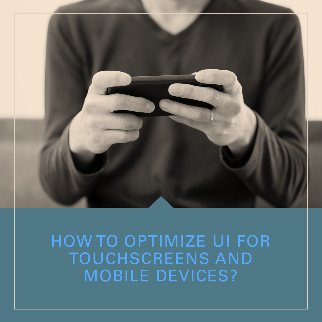

How to optimize UI for touchscreens and mobile devices?
Touchscreens and mobile devices have become the primary way that people interact with the internet and digital products. As a result, it is important to design user interfaces (UIs) that are optimized for touchscreens and mobile devices.
Here are some tips for optimizing UI for touchscreens and mobile devices:
- Use large touch targets. Touchscreens can be difficult to be precise with, so it is important to use large touch targets. This means making buttons and other interactive elements large enough for users to easily tap on them.
- Use clear and concise labels. Users should be able to quickly understand what each element of the UI does. Use clear and concise labels to identify buttons and other interactive elements.
- Use white space. White space can help to make your UI look less cluttered and easier to navigate. Use white space to separate different elements of your UI and to highlight important information.
- Use high-quality images. High-quality images can make your UI more visually appealing and engaging. However, avoid using too many images, as this can slow down the performance of your app.
- Use a responsive design. A responsive design will ensure that your UI looks good and functions well on all devices, regardless of screen size or resolution.
Here are some additional tips for optimizing UI for touchscreens and mobile devices:
- Use gestures. Gestures can be a great way to interact with touchscreens and mobile devices. However, be careful not to overload users with too many different gestures.
- Use feedback. Provide feedback to users when they interact with the UI. This will help them to know what is happening and to confirm that their actions have been registered.
- Test your UI with users. Once you have designed your UI, test it with users to get feedback. This will help you to identify any usability issues and make necessary refinements.
Examples of well-optimized UI for touchscreens and mobile devices
Here are some examples of well-optimized UI for touchscreens and mobile devices:
- Google Maps: Google Maps has a simple and user-friendly UI that is optimized for touchscreens and mobile devices. The UI is designed to be easy to navigate with one hand, and the buttons and other interactive elements are large enough for users to easily tap on.
- Facebook: Facebook also has a simple and user-friendly UI that is optimized for touchscreens and mobile devices. The UI is designed to be easy to navigate with one hand, and the buttons and other interactive elements are large enough for users to easily tap on.
- Twitter: Twitter also has a simple and user-friendly UI that is optimized for touchscreens and mobile devices. The UI is designed to be easy to navigate with one hand, and the buttons and other interactive elements are large enough for users to easily tap on.
Conclusion
By following the tips in this blog post, you can optimize your UI for touchscreens and mobile devices. This will help users to have a better experience when interacting with your product or service.tunesharemore_vert
techwitheldad.com
Eldad is a graphic designer and web developer with over 7 years of experience. He is also the founder and director of Vitna Media, a full-service digital marketing agency. Eldad has a passion for helping people learn and grow. He is also a strong believer in the power of technology to make the world a better place. In his spare time, Eldad enjoys spending time with his family and friends, playing music instruments and traveling.
Recent Posts
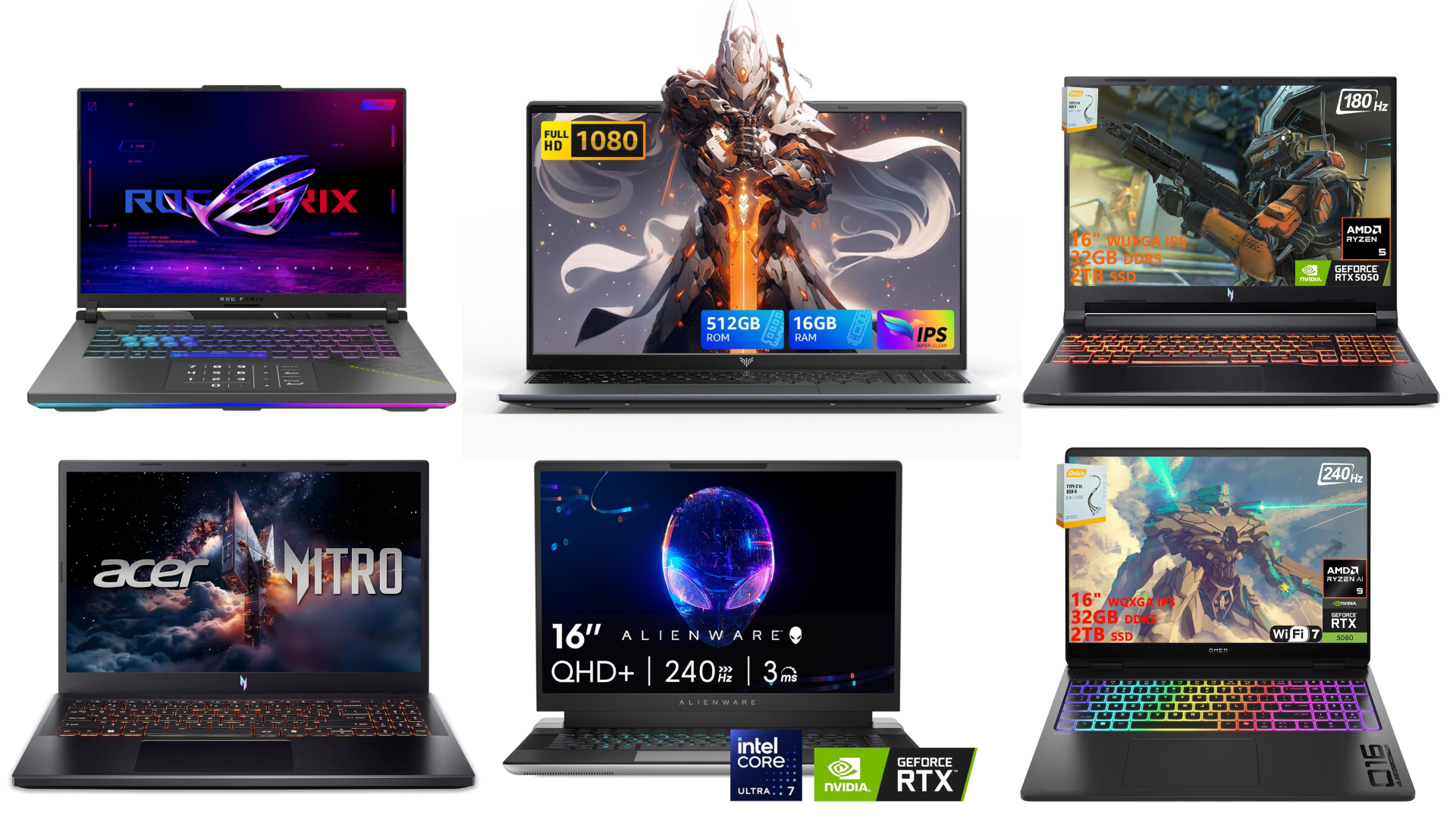
10 Best Gaming Laptops for 2026
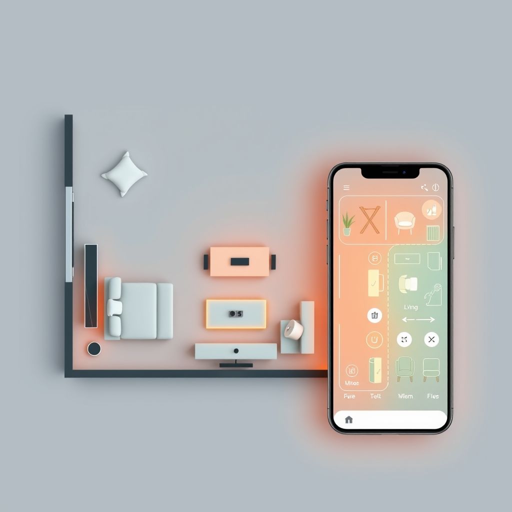
16 January 2026Studio555’s Playable App for Interior Design
16 June 2025Categories
Related Articles
10 Best Gaming Laptops for 2026
The gaming laptop market in 2026 has reached an exciting new milestone....
ByGlen16 January 2026Studio555’s Playable App for Interior Design
Okay, picture this: You’re scrolling through interior design inspo online (we’ve all...
Bytechwitheldad.com16 June 2025Aspora’s $50M Boost: Simplifying Money Transfers for Indians Abroad
Ever wondered why sending money back home can still feel like navigating...
Bytechwitheldad.com16 June 2025Navy’s New Startup Crush: Is This the Future of Defense Tech?
Forget the image of stuffy boardrooms and endless red tape. The U.S....
Bytechwitheldad.com16 June 2025





Leave a comment