- Home
- AI Solution Kits
- AI Analytics and Business Intelligence
- AI Coding and Development Tools
- AI Content Creation and Video Tools
- AI Customer Support Solutions
- AI Email and Communication Tools
- AI for E-Commerce
- AI Image and Creative Tools
- AI Marketing Automation
- AI Recruitment and HR Solutions
- AI Sales and Outreach Automation
- AI Workflow and Process Automation
- AI-Powered Communication and Phone Systems
- Solutions
- No-Code and App Building Solutions
- Recruitment and Talent Acquisition Solutions
- Scheduling and Calendar Management Solutions
- Sales and Outreach Solutions
- Security Solutions
- Social Media and Influencer Marketing Solutions
- Team Communication Solutions
- Training and Development Solutions
- Webinar and Video Marketing Solutions
- Website and E-commerce Solutions
- Workflow and Process Automation Solutions
- Productivity and Project Management
- Website and Customer Experience Optimization
- Tools
- Contact US
Recent Posts
How to design effective call-to-action buttons in graphic design?


How to design effective call-to-action buttons in graphic design?
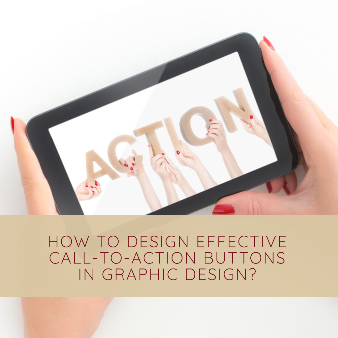
Call-to-action (CTA) buttons are essential elements in graphic design, serving as the bridge between your visual communication and the desired action you want your audience to take. They are the guiding lights that prompt visitors to engage with your content, whether it’s signing up for a newsletter, making a purchase, or downloading a resource.
Effective CTA buttons are not just about aesthetics; they are about psychology and persuasion. They need to be strategically designed to capture attention, convey urgency, and inspire a positive response. In this blog article, we’ll delve into the art and science of crafting compelling CTA buttons that drive conversions and elevate your graphic design projects.
Understanding the Anatomy of a Compelling CTA Button
A well-designed CTA button is a symphony of visual elements and persuasive copy that works in harmony to achieve a specific goal. Let’s break down the key components of an effective CTA button:
1. Clarity and Conciseness: The text on your CTA button should be clear, concise, and action-oriented. It should instantly convey the desired action and leave no room for ambiguity. Avoid using generic phrases like “Learn More” or “Click Here.” Instead, use specific verbs that directly relate to the action you want your audience to take, such as “Download Whitepaper,” “Sign Up for Free,” or “Start Your Free Trial.”
2. Prominence and Visual Appeal: Your CTA button should stand out from the rest of the design. Use a contrasting color that complements the overall aesthetic but doesn’t blend in. Consider using rounded corners for a softer, more inviting look, or sharp edges for a bolder, more assertive feel.
3. Size and Placement: The size and placement of your CTA button are crucial for ensuring its visibility and accessibility. Make sure the button is large enough to be easily noticed, but not so large that it becomes overwhelming. Place the button in a strategic location where it naturally draws the eye, such as above the fold or near the end of a compelling piece of content.
4. Negative Space and Contrast: Negative space, or whitespace, is your friend when it comes to CTA button design. Surrounding your button with ample negative space will make it stand out and create a sense of focus. Contrast, the visual difference between elements, is equally important. Use contrasting colors for the button and its text to ensure maximum readability and visual impact.
5. Typography and Readability: The font you choose for your CTA button text should be clear, legible, and consistent with the overall branding or tone of your design. Avoid using overly decorative or stylized fonts that might hinder readability. The text size should be large enough to be easily read across various screen sizes and devices.
Psychological Considerations for Effective CTA Buttons
Beyond the visual elements, there are psychological factors that play a significant role in the effectiveness of CTA buttons. Here are some key psychological principles to consider:
1. Urgency and Scarcity: People are more likely to act when they feel a sense of urgency or scarcity. Use phrases like “Limited Time Offer” or “Only 10 Spots Left” to create a sense of urgency and encourage immediate action.
2. Social Proof and Endorsements: Leverage social proof by incorporating testimonials, reviews, or trust badges from reputable sources. This can increase trust and encourage users to take the desired action.
3. Emotional Appeal: Tap into emotions like excitement, curiosity, or aspiration to connect with your audience on a deeper level. Use evocative language and imagery to resonate with their desires and motivations.
A/B Testing and Continuous Refinement
The design of effective CTA buttons is an iterative process. Don’t be afraid to experiment with different colors, sizes, placements, and copy variations. Use A/B testing to compare different versions of your CTA buttons and identify which ones perform best. Continuously refine your design based on data and user feedback to maximize conversion rates.
Examples of Effective CTA Button Design
Opens in a new windowwww.webfx.com
welldesigned CTA button from a popular website
Opens in a new windowadmiral.digital
another welldesigned CTA button from a different website
Conclusion
Designing effective CTA buttons is an art that requires a combination of visual creativity, psychological understanding, and data-driven optimization. By following the principles outlined in this blog article, you can craft compelling CTA buttons that drive conversions, enhance your graphic design projects, and achieve your desired marketing goals.
techwitheldad.com
Eldad is a graphic designer and web developer with over 7 years of experience. He is also the founder and director of Vitna Media, a full-service digital marketing agency. Eldad has a passion for helping people learn and grow. He is also a strong believer in the power of technology to make the world a better place. In his spare time, Eldad enjoys spending time with his family and friends, playing music instruments and traveling.
Recent Posts
10 Best Gaming Laptops for 2026
16 January 2026Rethinking AI: Is DeepSeek Rewriting the Rules?
14 June 2025Categories
Related Articles
10 Best Gaming Laptops for 2026
The gaming laptop market in 2026 has reached an exciting new milestone....
ByGlen16 January 2026Rethinking AI: Is DeepSeek Rewriting the Rules?
Okay, let’s talk AI. We’re constantly hearing about massive investments and crazy...
Bytechwitheldad.com14 June 2025Rethinking AI: DeepSeek’s Playbook Shakes Up the High-Spend, High-Compute Paradigm
Ever felt like the AI world is only accessible to those with...
Bytechwitheldad.com14 June 2025Rethinking AI: DeepSeek’s Playbook Shakes Up the High-Spend, High-Compute Paradigm
Ever feel like the AI world is a race only the richest...
Bytechwitheldad.com14 June 2025


Leave a comment