


How to choose the right color psychology in graphic design?
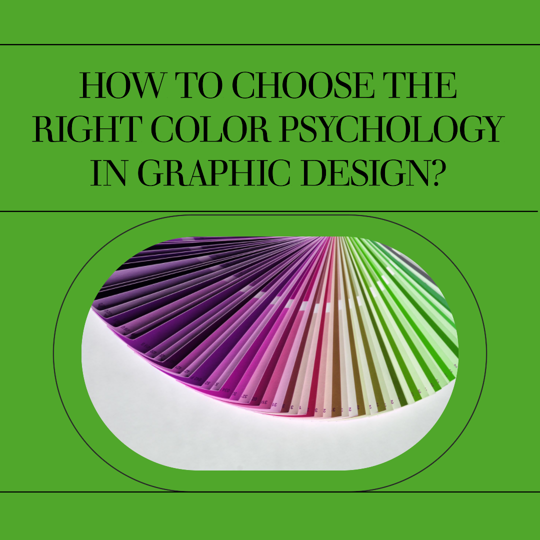
How to choose the right color psychology in graphic design?
In the realm of graphic design, color is more than just an aesthetic choice; it’s a powerful tool that can influence emotions, perceptions, and behaviors. Color psychology, the study of how colors affect human emotions and behavior, provides valuable insights for designers to create visually appealing and effective communication.
The Emotional Palette: Understanding Color Associations
Each color carries a unique set of associations and evokes a range of emotions. These associations can be influenced by cultural background, personal experiences, and societal norms. For instance, red is often associated with passion, excitement, and danger, while blue is typically linked to calmness, trustworthiness, and loyalty.
Color Harmony and Visual Appeal
Beyond their individual meanings, colors also interact with each other, creating harmonies or clashes that can enhance or detract from the overall visual appeal of a design. Understanding color theory and the principles of color harmony is essential for creating visually pleasing and effective compositions.
Strategic Color Selection in Graphic Design
Graphic designers harness the power of color psychology to achieve specific communication goals. By carefully selecting and applying colors, designers can:
1. Evoke Desired Emotions: Colors can be used to evoke specific emotions in the viewer, influencing their mood and perception of the design. For example, warm colors like red and orange can create a sense of energy and excitement, while cool colors like blue and green can convey tranquility and sophistication.
2. Guide Attention: Color can be used to guide the viewer’s attention through a design, drawing their eye to important elements or highlighting key messages. Contrasting colors can create visual emphasis, while complementary colors can create a sense of balance and harmony.
3. Reinforce Branding: Color plays a crucial role in establishing and reinforcing brand identity. Consistent use of brand colors across all design elements helps create a cohesive brand image and recognition.
4. Communicate Cultural Sensitivity: Colors have different meanings and associations in different cultures. Designers should be mindful of cultural sensitivities when selecting colors for international audiences.
Understanding Color Psychology in Action
Let’s explore how color psychology is applied in various graphic design applications:
1. Website Design: Color choices on a website can influence user engagement, brand perception, and conversion rates. Warm colors can stimulate action and encourage purchases, while cool colors can promote trust and credibility.
2. Packaging Design: Color plays a significant role in packaging design, influencing consumer perceptions of the product’s quality, taste, and brand identity. Bright, bold colors can attract attention, while softer, more subdued colors can convey sophistication or luxury.
3. Advertising Design: Color is a powerful tool in advertising, used to evoke emotions, convey messages, and differentiate brands from competitors. Advertisers use color to capture attention, create a sense of urgency, and influence purchasing decisions.
4. User Interface Design: Color choices in user interfaces can impact usability, accessibility, and user experience. Clear color hierarchies and contrasting colors can enhance readability and navigation, while excessive use of bright or jarring colors can cause eye strain and fatigue.
Considerations for Effective Color Use
When applying color psychology in graphic design, consider the following factors:
1. Target Audience: Understanding the target audience’s cultural background, preferences, and expectations is crucial for selecting appropriate colors.
2. Context and Purpose: Consider the context in which the design will be used and the specific message it aims to convey.
3. Balance and Harmony: Use color in a balanced and harmonious way to avoid overwhelming the viewer or detracting from the overall design.
4. Accessibility: Ensure that color choices do not compromise accessibility for individuals with color blindness or visual impairments.
A/B Testing and Refinement
Color psychology is not an exact science, and individual perceptions can vary. A/B testing, comparing different color variations of a design, can provide valuable insights into user preferences and optimize color choices for maximum impact.
Conclusion
Color psychology is an invaluable tool for graphic designers, providing a deeper understanding of how colors influence emotions, perceptions, and behaviors. By strategically selecting and applying colors, designers can create visually appealing, effective communications that resonate with their target audience and achieve their desired communication goals. Remember, color is not just about aesthetics; it’s about connecting with your audience on an emotional level and guiding them towards the desired action.


Related Articles
10 Best Gaming Laptops for 2026
The gaming laptop market in 2026 has reached an exciting new milestone....
Studio555’s Playable App for Interior Design
Okay, picture this: You’re scrolling through interior design inspo online (we’ve all...
Aspora’s $50M Boost: Simplifying Money Transfers for Indians Abroad
Ever wondered why sending money back home can still feel like navigating...
Navy’s New Startup Crush: Is This the Future of Defense Tech?
Forget the image of stuffy boardrooms and endless red tape. The U.S....
Leave a comment