


Decoding Bitcoin Candlesticks: Your No-Experience-Needed Guide
Candlestick charts are a visual way to represent price movements over a specific period. Each “candle” tells a story about what happened during that time – whether the price went up, down, or stayed relatively the same.
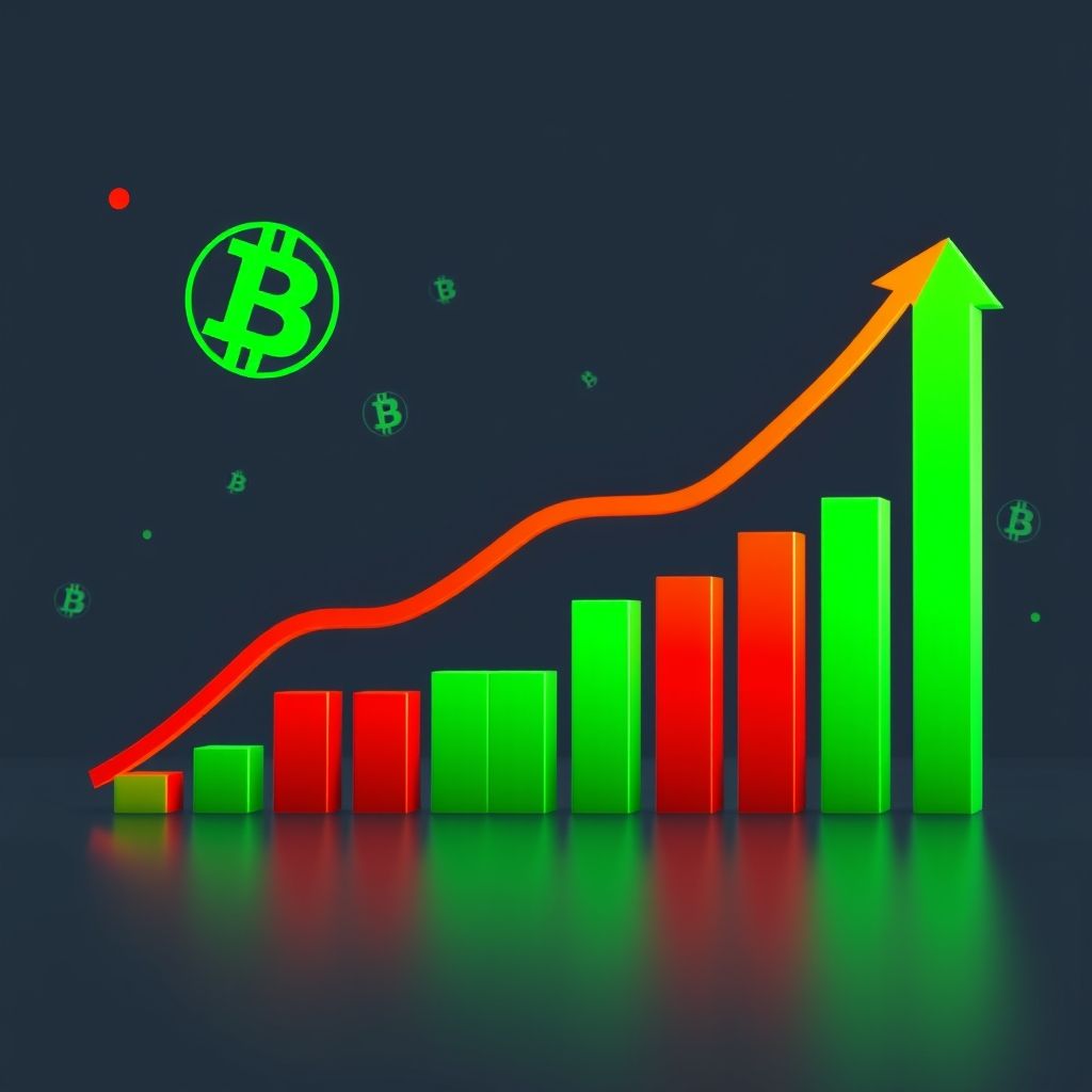
Think of each candle as having a body and wicks (also called shadows). The body represents the opening and closing prices. A green (or sometimes white) body means the closing price was higher than the opening price – good news, the price went up! A red (or black) body means the opposite – the closing price was lower than the opening price. Ouch, the price went down.
The wicks, or shadows, show the highest and lowest prices reached during that period. So, a long upper wick means the price spiked high but then came back down. A long lower wick means the price dipped low but then bounced back up.
Knowing how to read these charts gives you a massive advantage. You can start to:
- Spot Trends: Identify if the price is generally moving upwards (an uptrend), downwards (a downtrend), or sideways (consolidating).
- Understand Market Sentiment: Gauge whether buyers or sellers are in control.
- Make Smarter Decisions: Use the information to inform your buying and selling strategies, reducing the guesswork.
While there are dozens of patterns, here are a few common ones to get you started:
-
Doji: A Doji is formed when the opening and closing prices are virtually the same. It looks like a cross or a plus sign and indicates indecision in the market. It could signal a potential reversal of a trend.
-
Hammer: This pattern looks like a hammer. It has a small body at the top and a long lower wick. It appears during a downtrend and suggests that although sellers pushed the price down, buyers stepped in and drove the price back up, potentially signaling a bullish reversal.
-
Inverted Hammer: This is the opposite of the hammer, with a small body at the bottom and a long upper wick. It appears during an uptrend and suggests that although buyers tried to push the price higher, sellers stepped in and drove the price back down, potentially signaling a bearish reversal.
-
Engulfing Pattern: This pattern consists of two candles. A bullish engulfing pattern occurs when a green candle completely “engulfs” the previous red candle, signaling strong buying pressure. A bearish engulfing pattern is the opposite, with a red candle engulfing a green candle, signaling strong selling pressure.
Reading candlestick charts isn’t a crystal ball. It’s just one tool in your toolbox. Always combine it with other forms of analysis, like fundamental analysis (understanding the underlying technology and market factors), and manage your risk carefully.


Related Articles
10 Best Gaming Laptops for 2026
The gaming laptop market in 2026 has reached an exciting new milestone....
Studio555’s Playable App for Interior Design
Okay, picture this: You’re scrolling through interior design inspo online (we’ve all...
Aspora’s $50M Boost: Simplifying Money Transfers for Indians Abroad
Ever wondered why sending money back home can still feel like navigating...
Navy’s New Startup Crush: Is This the Future of Defense Tech?
Forget the image of stuffy boardrooms and endless red tape. The U.S....
Leave a comment